
Flutter offers a wealth of widgets to build stunning user interfaces. But with great flexibility comes the challenge of managing overflow in each widget. Overflow occurs when content exceeds the space available for display, leading to messy UI (user interface) issues. In this guide, we will explore how to tackle overflow in various widgets, offering simple yet effective strategies to keep your Flutter application polished and professional.
Understanding Widget Overflow

Overflow is like trying to fit a square peg into a round hole – when content does not fit neatly within its widget boundaries, it spills over, which causes visual clutter. In Flutter, this can happen with texts, images, or any widget that contains content.
Common Widget Overflow Scenarios:
- Text Overflow – Text spills beyond its container when it is too long, resulting in unreadable or truncated text.
- Image Overflow – Images spill out their containers, leading to cropping, distortion, or content that is cut off.
- Container Widgets (e.g., Row, Column, Container) – Child widgets within containers overflow their bounds, disrupting layout integrity.
Overflow Management Techniques for Every Widget
- Text Widget
- TextOverflow Property – Utilize properties like overflow to specify how text should behave when it exceeds its container.
Here are the available options for the TextOverflow property in Flutter:
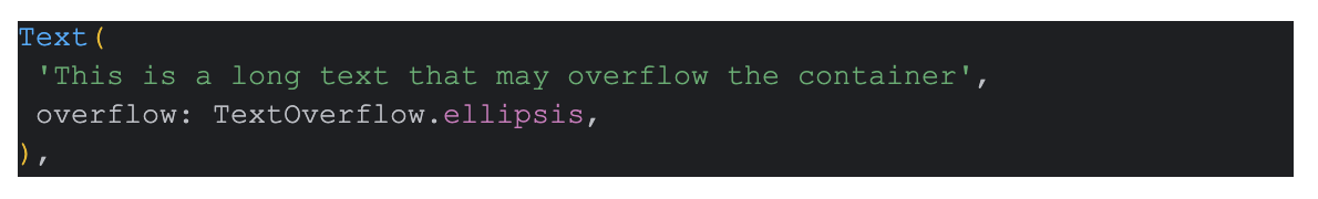
ellipsis: This option indicates that overflowing text should be truncated and an ellipsis (…) should be displayed to indicate that the text has been cut off.
Eg:-
clip: With this option, overflowing text is simply clipped and not displayed beyond the boundaries of the container.
Eg:-

fade: When using this option, overflowing text is gradually faded out as it reaches the boundaries of the container, giving a visual indication that the text is truncated.
Eg:-

visible: This option allows overflowing text to extend beyond the boundaries of the container, potentially overlapping other content.
Eg:-


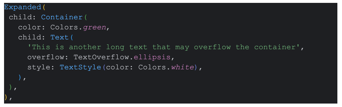
2. Flexible Text – Wrap text widgets with Flexible or Expanded to allow them to adjust their size according to available space.
Example using Flexible

Example using Expanded
- Image Widget
- BoxFit Property – Specify BoxFit to control how images are fitted within their containers, preventing overflow or distortion.
BoxFit.cover:
The cover property scales and positions the image to cover the entire space of its container while maintaining its aspect ratio.
This means that the image will be scaled proportionally to cover the entire space without stretching or distorting it, and any parts of the image that exceed the container’s dimensions will be cropped.
BoxFit.contain:
The contain property scales and positions the image to fit entirely within the container while preserving its aspect ratio.
This means that the entire image will be visible within the container, and empty space may appear around the image if the container’s dimensions are larger than the image’s dimensions.
BoxFit.fill:
The fill property scales the image to fill the entire space of its container without preserving its aspect ratio.
This means that the image will be stretched or compressed to fill the entire space, potentially distorting its appearance.
BoxFit.fitHeight:
The fitHeight property scales the image to fit the height of its container while preserving its aspect ratio.
This means that the image will be scaled proportionally to fit the height of the container, and the width may extend beyond the container’s dimensions if necessary.
BoxFit.fitWidth:
The fitWidth property scales the image to fit the width of its container while preserving its aspect ratio.
This means that the image will be scaled proportionally to fit the width of the container, and the height may extend beyond the container’s dimensions if necessary.
Eg:-

2. ClipRRect Widget – Wrap images with ClipRRect to clip them within their boundaries and avoid overflow issues.
Eg:-

- Container Widget
- Constraints – Set constraints for containers and layout widgets to define their maximum size and prevent child widgets from overflowing.
Eg:-

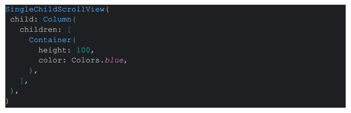
2. Scrollable Widgets – Use scrollable widgets like SingleChildScrollView to enable scrolling when content exceeds available space. ListView is also an option.
Eg:-
Best Practices for Handling Overflow in Every Widget
- Design Responsively – Create layouts that adapt gracefully to various screen sizes and orientations, reducing the likelihood of overflow issues.
- Thorough Testing – Test your app across different devices to identify and address overflow problems early in the development process.
- Widget Sizing – Ensure widgets are appropriately sized and constrained to maintain a cohesive and visually appealing layout.
Overflow management is an essential aspect of crafting polished and user-friendly Flutter applications. By understanding common overflow scenarios, implementing effective management techniques for each widget, and following best practices, developers can maintain a seamless and professional user experience. With careful attention to detail and proactive handling, overflow challenges can be resolved, ensuring that Flutter apps shine across all platforms and devices.
 Josh Software