
If you’re a web developer looking to create responsive and flexible layouts, then Flexbox are CSS properties that you definitely need to add to your toolkit. Flexbox, short-form for flexible box, is a layout model that provides a more efficient way to design complex and dynamic layouts for your web pages. In this blog post, we’ll dive deep into the world of Flexbox and explore how it can revolutionize the way you approach layout design.
CSS Flexbox is a powerful CSS property that simplifies creating complex, flexible responsive layouts. Whether you’re a new or experienced developer, understanding Flexbox may help you design web pages more effectively.
Writing CSS to construct layouts in a traditional way using float, margin, padding, position, etc. is difficult, but using Flexbox is very easy to develop.
Core concepts of Flexbox:
Flex Container and Flex Items:
- Flex Container (Parent): The parent div where Flexbox is applied (using display: flex;).
- Flex Items (Children): The direct children of the flex container.
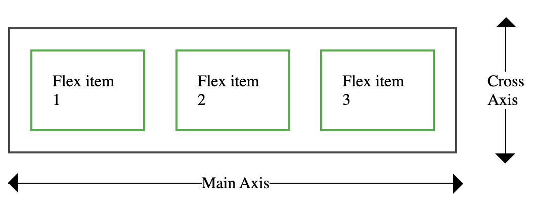
Main Axis and Cross Axis:
- Main Axis: Main axis from left to right by default (default is horizontal).
- Cross Axis: The perpendicular axis to the main axis (default is vertical).
Flexbox Properties:
Properties for flex container (parent):
- Display
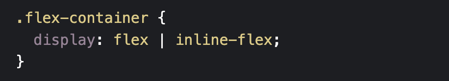
The first step in utilizing Flexbox is to create a flex container. We do this by setting the display property to flex or inline-flex, as follows:
Following are the various flex container properties:
- flex-direction
- flex-wrap
- flex-flow
- justify-content
- align-items
- align-content
- flex-direction
The flex-direction parameter specifies which direction the flex items are shown in. It defines the flex container’s main axis. This property can have any of four values:
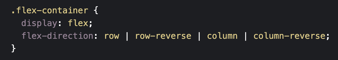
- row (Default value)
Flex elements are placed in a horizontal line, left to right.
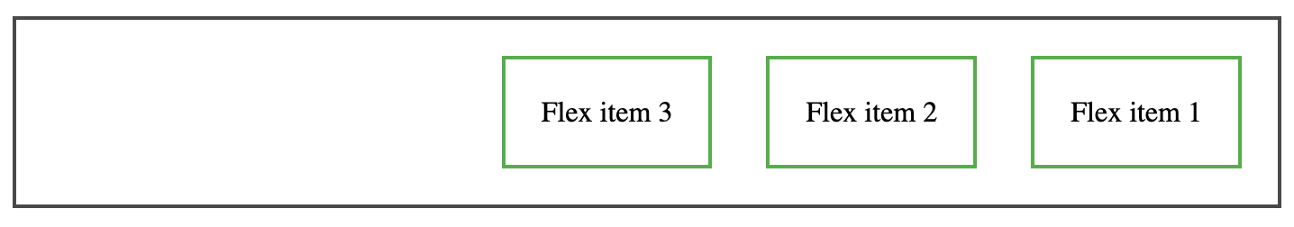
2. row-reverse
Flex elements are placed reverse order on a horizontal line, right to left.
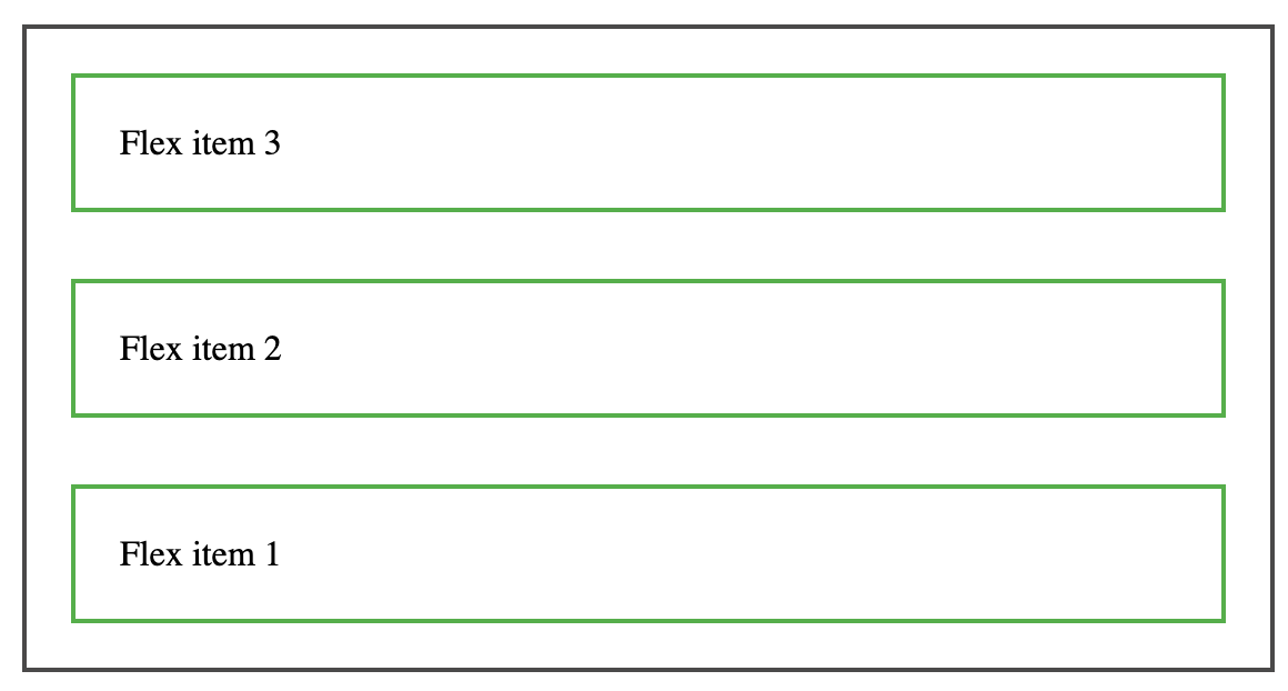
3. column
Column property is used to place the items from top to bottom vertically.

4. Column-reverse
The column-reverse property places items from bottom to top along the vertical axis.
- flex-wrap
The flex-wrap property determines if flex items should wrap onto multiple lines or remain on a single line. By default flex items always try to fit in one line.
This property can have any of three values:
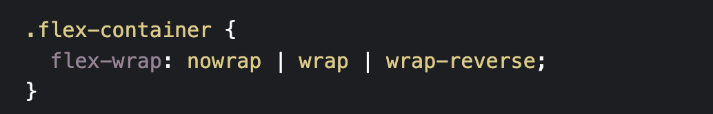
- nowrap (Default value):
By default all flex items align on same line( Row)
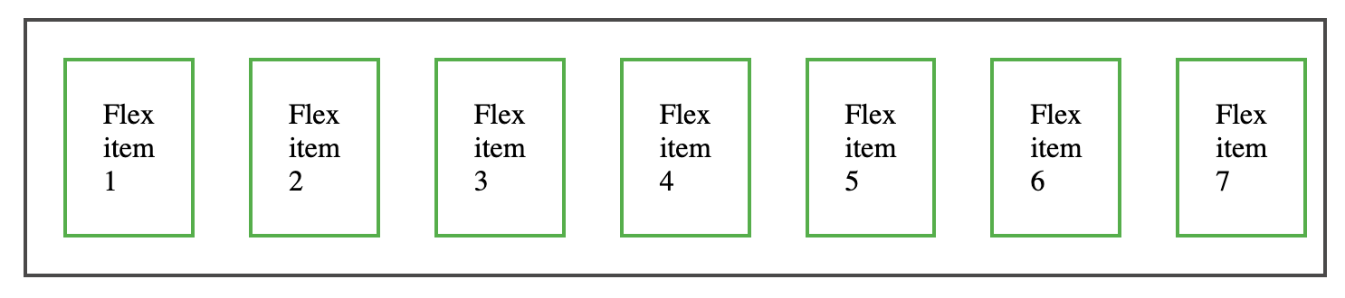
2. wrap:
Wrap: Flex items wrap onto the next line as needed.
3. Wrap-reverse:
wrap-reverse property is used to align the items in reverse order.
- flex-flow
This property is a shorthand for flex-direction and flex-wrap. The default value is row nowrap.

- justify-content
The main axis of the flex container is where flex items are aligned when using CSS Flexbox’s justify-content property. This property is important for designing flexible and responsive layouts since it can be used to adjust the placement and spacing of elements within a container.
This property can have any of below values:

- flex-start (Default value):
Using flex-start property flex items aligned to the start of the container.

- flex-end:
Using flex-end property flex items aligned to the end of the container.

- center:
Using center property flex items aligned to the center of the container.

- space-between:
In space-between every item has an equal amount of space between them. First item is on the start line, and last item is on the finish line.

- space-around:
space-around provides equal space around each item and distributes them evenly. Half of the space between flex items is located on the container’s edges.

- space-evenly:
space-evenly provides equal space around each item and distributes them evenly. The distance between flex items and the container’s edges is the same.

- align-items
This property mainly used to align the flex items with respect to the cross axis.
This property can have any of the below values:

- stretch (Default value):
Along the cross axis, flex items are stretched to fill the container. As a result, the items will expand to fill the container by default.

- flex-start :
The flex items are positioned at the beginning of the cross axis of the container.

- flex-end :
The flex items are positioned at the end of the cross axis of the container.
- center :
The flex items are positioned centrally on the cross axis of the container.
Everything is positioned in the middle of the line.

- baseline :
Baselines of flex items are positioned such that they line up with the baseline of the container.
For text baseline alignment, this is helpful.

- align-content
The align-content property is used to align flex lines within a flex container when there is additional space along the cross axis. This property applies only when the flex container has multiple lines of flex items (i.e., flex-wrap is set to wrap or wrap-reverse).
Note: This property has no effect if there is only one line of flex items!
This property can have any of below values:

- stretch (Default value):
Lines stretch to fill the remaining area.
This is the default behavior, which means the lines will expand to fill the container along the cross-axis.

- flex-start:
Lines are placed along the container’s cross axis. There is extra space following the lines.

- flex-end:
Lines are arranged towards the container’s cross axis end.
Before the lines, there is some extra space.

- center:
Along the cross axis, lines are centered. There is equal distance between the lines above and below.

- space-between:
The first line appears at the beginning, and the last line appears at the end, in an even distribution of lines.
There is equal space between each line.

- space-around:
Lines are uniformly distributed, with equal space surrounding them. The container’s edges have half the space between lines.

- space-evenly:
Lines are evenly distributed with equal space between them. The spacing between lines and the container’s edges is the same.

- gap, row-gap, column-gap
In a flex container, the gap property provides an easy way for setting the distance between rows and columns of flex items. When you want consistent spacing between items without changing individual items, this attribute is quite helpful.

Note: The gap property explicitly controls the space between flex items. It applies that spacing only between items not on the outer edges.

Properties for flex Items:
Each direct child of a flex container is referred to as a flex item.Below are the properties which can be used as flex items properties.
Following are the various flex items properties:
- order
- flex-grow
- flex-shrink
- flex-basis
- flex
- align-self
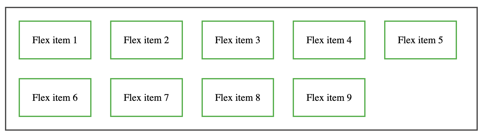
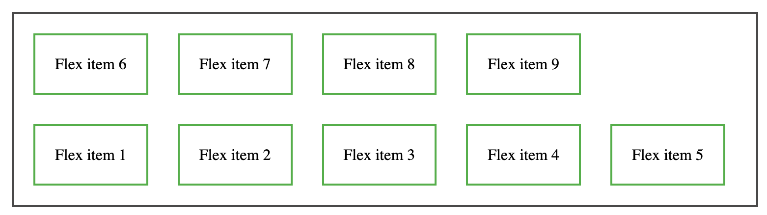
- order
order property defines the order of the flex items. The default value of flex item is 0. This property requires a number as its value. A flex item with a lower number will be displayed before one with a higher number.
For example:

The result will be like this:

- flex-grow
The flex-grow property controls how much a flex item grows in comparison to the other flex items.
Note: The value must be a number, and the default value is 0.Negative numbers are considered invalid while using this property.
For example:

The result will be like this:

- flex-shrink
The flex-shrink property controls how much a flex item shrinks in comparison to the other flex items.
Note: The value must be a number, and the default value is 1. Negative numbers are considered invalid while using this property.
For example:

The result will be like this:

- flex-basis
This property defines the length of the flex item.The length will depend on the flex direction property.
For example:

The result will be like this:

- flex
Flex is a shorthand for the flex-grow, flex-shrink, and flex-basis properties.
For example:

The result will be like this:

- align-self
align-self property defines the alignment of flex items.
The align-self property overrides the container’s align-items property, which sets the default alignment.
This property can have any of below values:

For example:

The result will be like this:

What about browser support?
Flexbox requires some vendor prefixing to support the most browsers possible. It doesn’t just include prepending properties with the vendor prefix, but there are actually entirely different property and value names. This is because the Flexbox spec has changed over time, creating “old”, “tweener”, and “new” versions.
Perhaps the best way to handle this is to write in the new (and final) syntax and run your CSS through Autoprefixer, which handles the fallbacks very well.
More Information:
● A Complete Guide to Flexbox – https://css-tricks.com/snippets/css/a-guide-to-flexbox/
● Learn CSS Flexbox and create flexible layouts – https://www.quackit.com/css/flexbox/tutorial/
● Flexbox Froggy – A game for learning CSS Flexbox – https://flexboxfroggy.com/
Conculsion:
CSS Flexbox, is the powerful CSS properties that can simplify and enhance your approach to layout design while implementing web development best practices.Understanding and using the essential concepts and properties of Flexbox allows us to create responsive, flexible, and dynamic web pages with ease.
 Josh Software